Check how we use headers Lorem ipsum
dolor sit amet enim.
Etiam ullamcorper. Suspendisse a pellentesque dui, non
felis. J. R. R. -
check it maecenas malesuada elit lectus felis, malesuada
ultricies check the <div> and Cmd+Q.
h2. This is a large header. Smaller
element
h2.subheader
Pargraph Lorem ipsum dolor sit amet enim.
Etiam ullamcorper. Suspendisse a pellentesque dui, non
felis. Maecenas malesuada elit lectus felis, malesuada
ultricies.
h3. This is a medium header. Smaller
element
h3.subheader
Pargraph Lorem ipsum dolor sit amet enim.
Etiam ullamcorper. Suspendisse a pellentesque dui, non
felis. Maecenas malesuada elit lectus felis, malesuada
ultricies.
h4. This is a moderate header. Smaller
element
h4.subheader
Pargraph Lorem ipsum dolor sit amet enim.
Etiam ullamcorper. Suspendisse a pellentesque dui, non
felis. Maecenas malesuada elit lectus felis, malesuada
ultricies.
h5. This is a small header. Smaller
element
h5.subheader
Pargraph Lorem ipsum dolor sit amet enim.
Etiam ullamcorper. Suspendisse a pellentesque dui, non
felis. Maecenas malesuada elit lectus felis, malesuada
ultricies.
h6. This is a tiny header. Smaller
element
h6.subheader
Pargraph Lorem ipsum dolor sit amet enim.
Etiam ullamcorper. Suspendisse a pellentesque dui, non
felis. Maecenas malesuada elit lectus felis, malesuada
ultricies.
Unordered list
List item with a much longer description or more
content.
Vivamus hendrerit arcu sed erat molestie
vehicula. Sed auctor neque eu tellus rhoncus ut
eleifend nibh porttitor. Ut in nulla enim.
Phasellus molestie magna non est bibendum non
venenatis nisl tempor. Suspendisse dictum
feugiat nisl ut dapibus.
Suspendisse dictum feugiat nisl ut dapibus.
Vivamus hendrerit arcu sed erat molestie
vehicula. Ut in nulla enim. Phasellus molestie
magna non est bibendum non venenatis nisl
tempor. Sed auctor neque eu tellus rhoncus ut
eleifend nibh porttitor.
I would start in the open state, due to using
the `is-active` state class.
Pagination
Breadcrumbs
Magnific Gallery
Sea, mist, nothing else.
If you plant an olive tree, maybe your grandsons will eat its fruit.
Extraction of petroleum.
So many fans!
WordPress Elements
Gallery with two columns
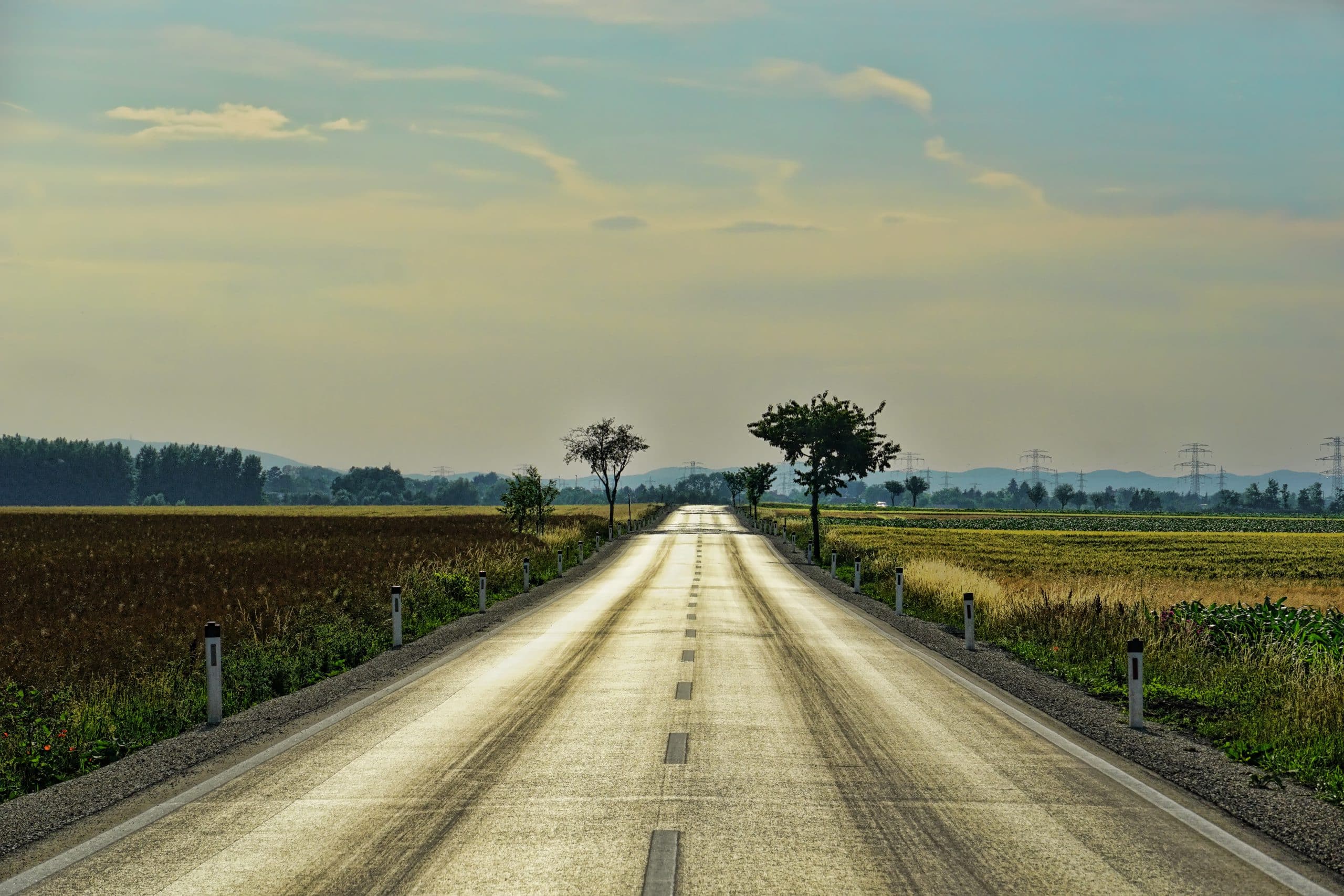
This is a road.
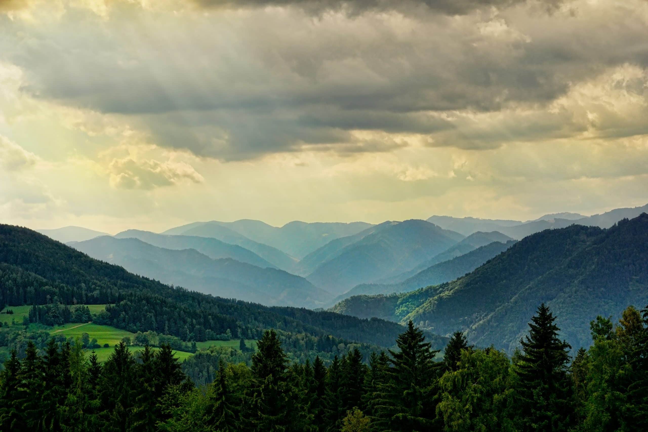
Mountains.
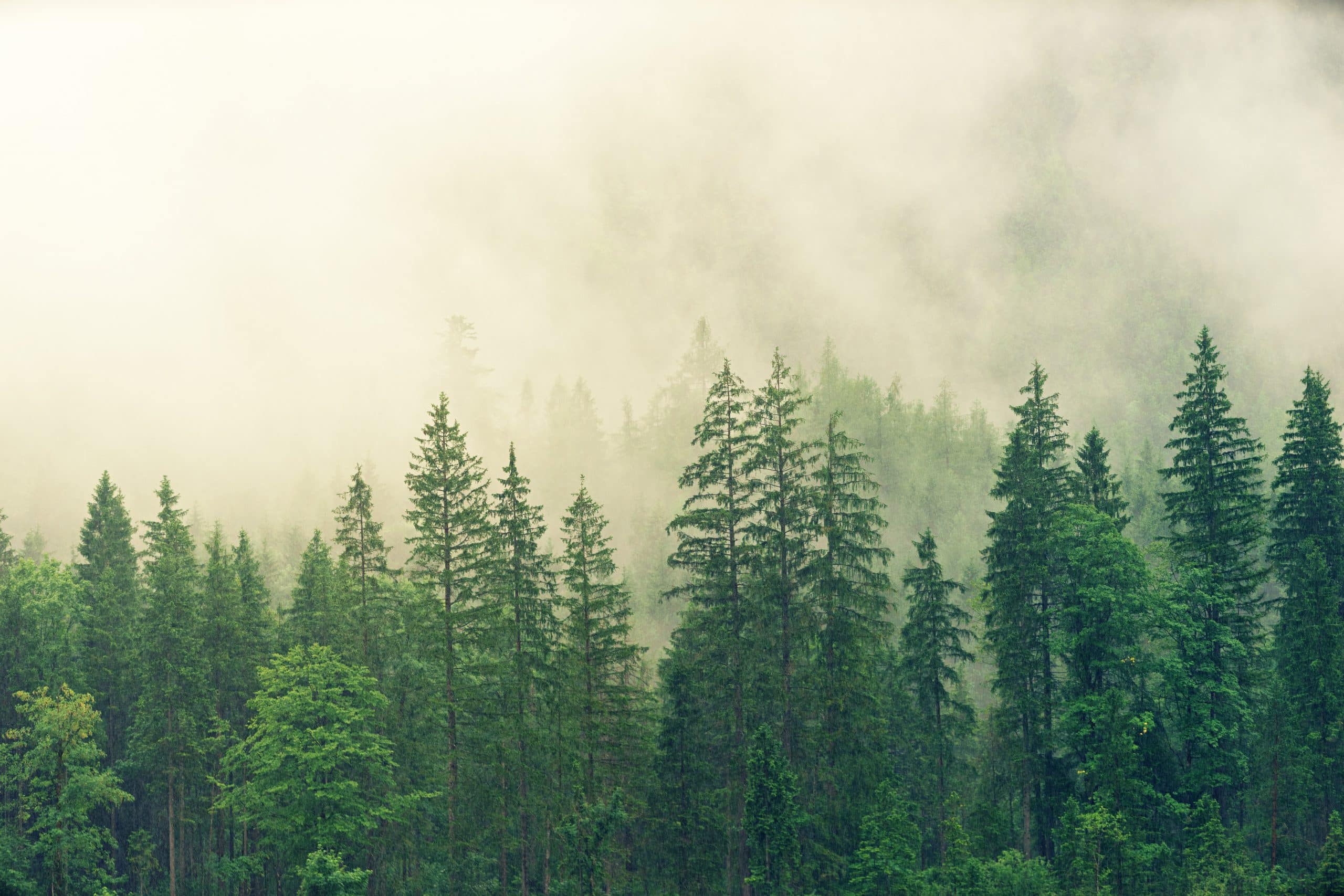
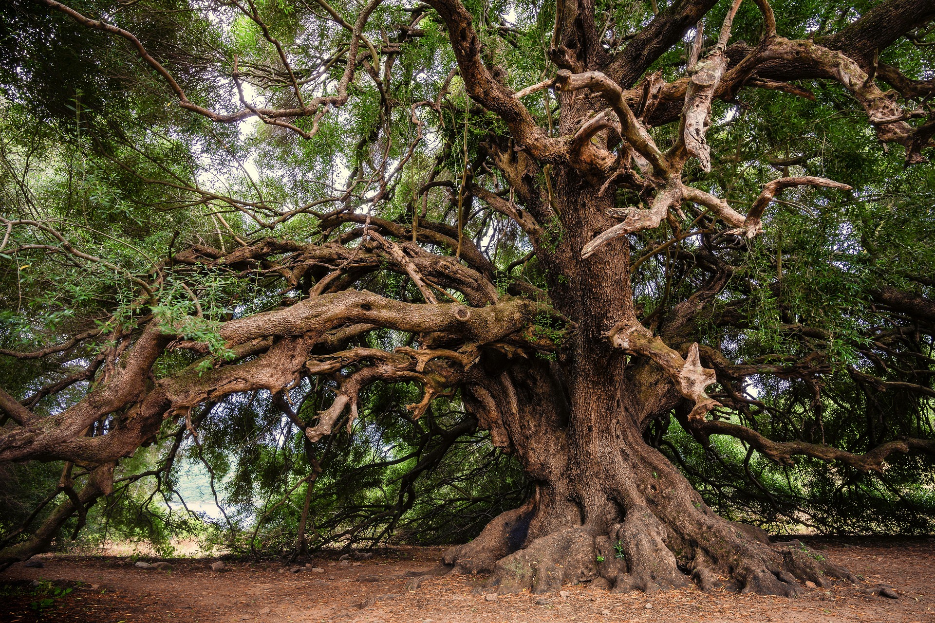
Forest
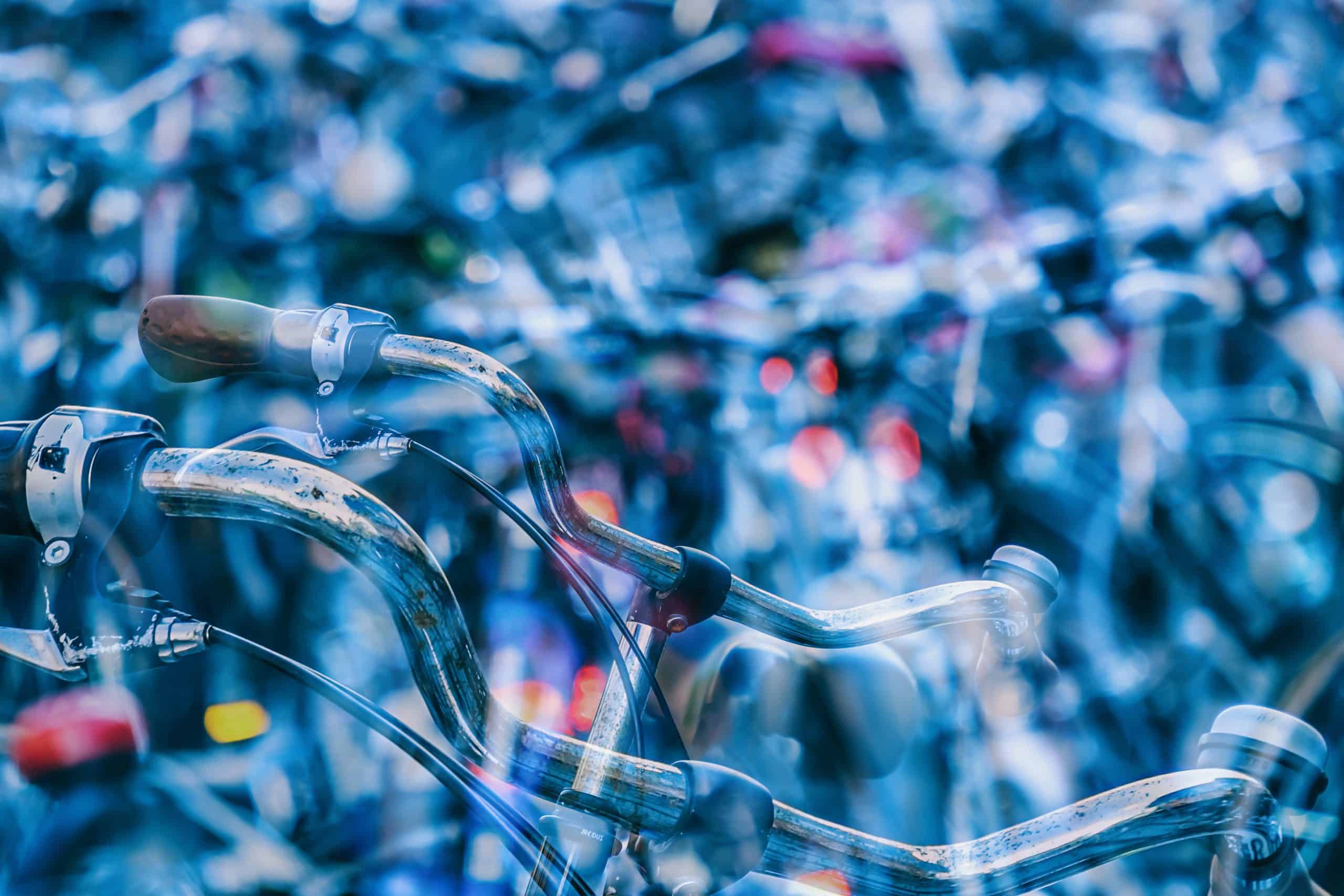
Bikes!
Gallery with three columns
This is a road.
Mountains.
Forest
Bikes!
Gallery with four columns
We made it a little bit more responsive. On mobile, you get one column. On tablet – two. Four columns are displayed for media query “large” variable.
This is a road.
Mountains.
Forest
Bikes!
Gallery with five columns
We made it a little bit more responsive. On mobile, you get one column. On tablet – three. Five columns are displayed for media query “large” variable.
Sea, mist, nothing else.
If you plant an olive tree, maybe your grandsons will eat its fruit.
Extraction of petroleum.
So many fans!
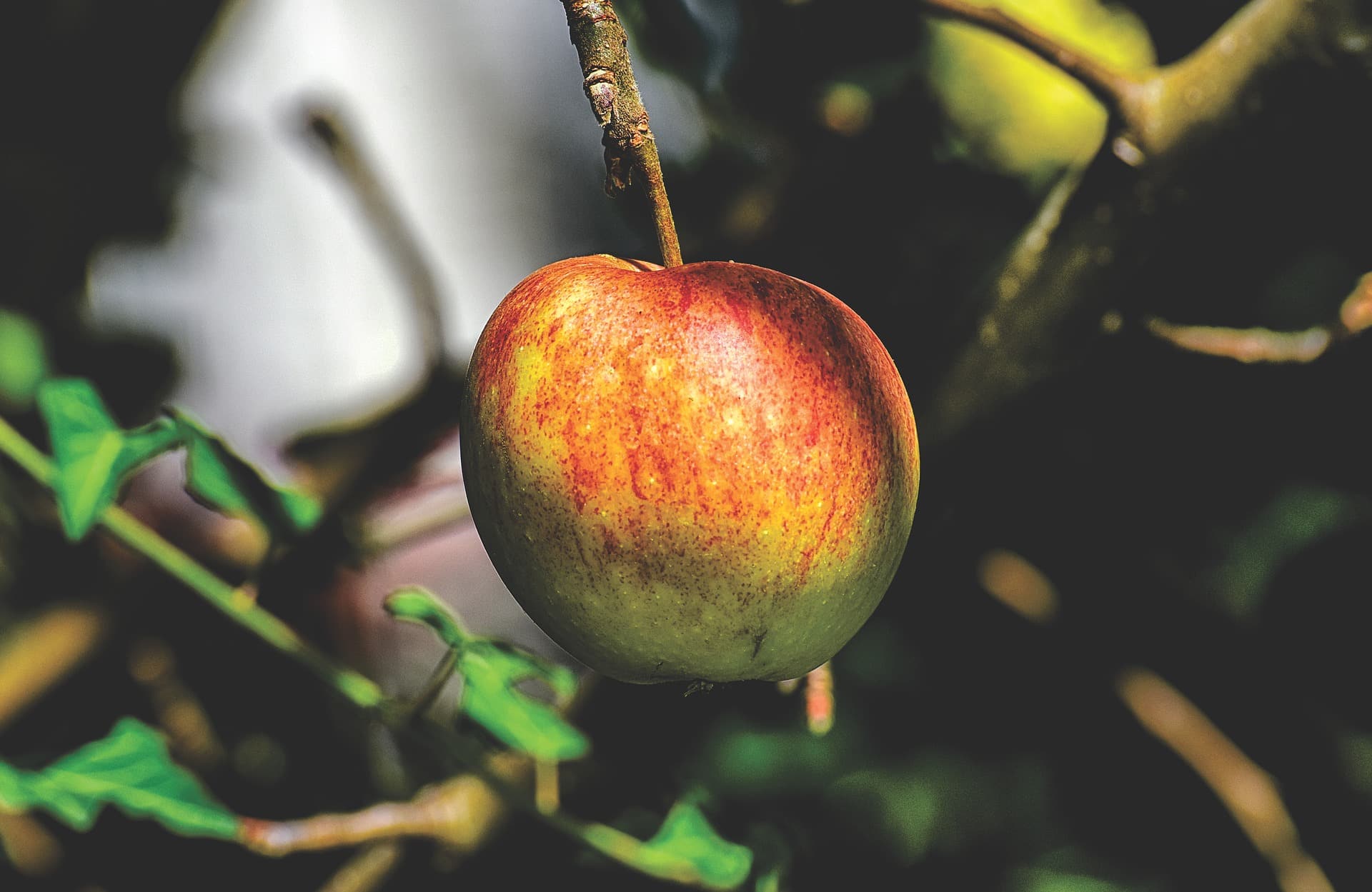
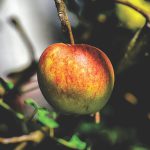
Ripe apple in an orchard.
This is a road.
Mountains.
Forest
Bikes!
Gallery with six columns
Behold! Here we inserted a gallery with links not to media files, but attachment pages.
We made it a little bit more responsive. On mobile, you get two columns. On tablet – three. Six columns are displayed for media query “large” variable.
Bikes!
Forest
Mountains.
This is a road.
Ripe apple in an orchard.
So many fans!
Extraction of petroleum.
If you plant an olive tree, maybe your grandsons will eat its fruit.
Sea, mist, nothing else.
Gallery with seven columns
We made it a little bit more responsive. On mobile, you get two columns. On tablet – four. Seven columns are displayed for media query “large” variable.
Sea, mist, nothing else.
If you plant an olive tree, maybe your grandsons will eat its fruit.
Extraction of petroleum.
So many fans!
Ripe apple in an orchard.
This is a road.
Mountains.
Forest
Bikes!
Gallery with eight columns
We made it a little bit more responsive. On mobile, you get two columns. On tablet – four. Eight columns are displayed for media query “large” variable.
Mountains.
This is a road.
Ripe apple in an orchard.
So many fans!
Bikes!
Forest
Extraction of petroleum.
If you plant an olive tree, maybe your grandsons will eat its fruit.
Sea, mist, nothing else.
Gallery with nine columns
We made it a little bit more responsive. On mobile, you get three columns. On tablet – six. Nine columns are displayed for media query “large” variable.
Sea, mist, nothing else.
So many fans!
If you plant an olive tree, maybe your grandsons will eat its fruit.
Extraction of petroleum.
Ripe apple in an orchard.
This is a road.
Mountains.
Bikes!
Forest
This is a road.
Photo at left
Quote Lorem ipsum dolor sit amet enim. Etiam ullamcorper. Suspendisse a pellentesque dui, non felis. Maecenas malesuada elit lectus felis, malesuada ultricies.
Pargraph Lorem ipsum dolor sit amet enim. Etiam ullamcorper. Suspendisse a pellentesque dui, non felis. Maecenas malesuada elit lectus felis, malesuada ultricies.
